

Wallaroo is a new range of healthy snacks for kids.
'We are on a mission to encourage growing children to make better food choices by questioning where their food comes from, what it is made of and its impact on our environment.'
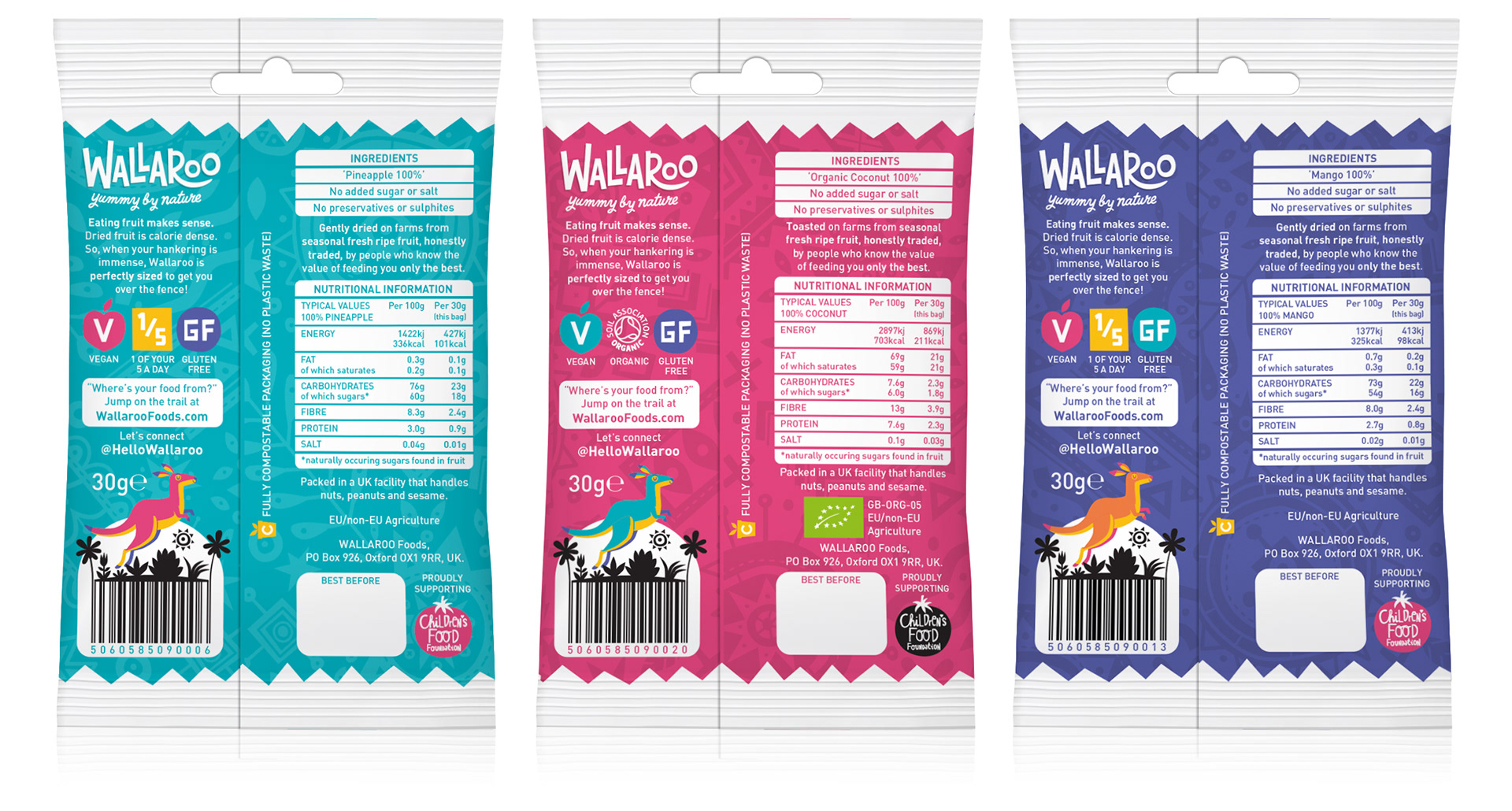
connect @hellowallaroo
compostable packaging by Parkside Printing.

L O G O D E V E L O P M E N T
The first job was developing the Wallaroo logo. (In case you didn't know (and we didn't), a wallaroo is a cross between a wallaby and a kangaroo). Firstly, keeping the logo compact was necessary due to the limited space on the packs. Secondly, finding the right balance between appealing to kids and looking healthy to parents was probably the trickiest part.
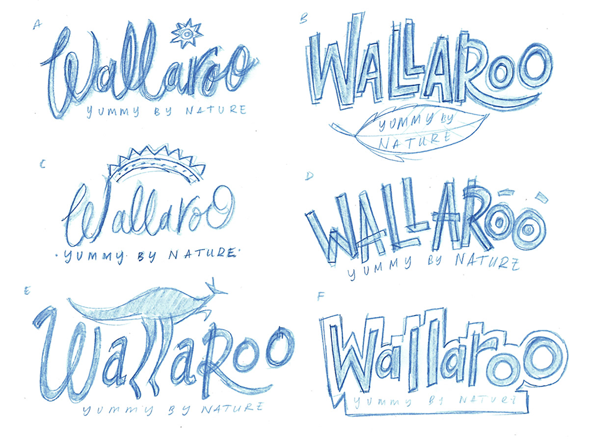
Initial rough logo sketches

Final design for the logo - the tail on the 'R' hinting at it's marsupial origin
C H A R A C T E R D E S I G N
One of the obstacles when designing characters for kids is that what appeals to 6 yr olds is rejected by 12 yr olds and vice versa. Trying to find something that appeals to both can be tricky. For this reason, we aimed for a more graphic feel with stick man arms and legs. By using tribal masks, we were able to make the characters quirky and keep the eyes neutral, which feels less childlike. Adding the headband leaves allows to break up of shapes and add colour.

Initial designs always start with pencil sketches in sketchbook
C O L O U R S
The packs were printed on a nine colour press meaning after CMYK we had 5 spot colours to use across the 3 packs. We wanted a palette that was bright, fun and contemporary. So we picked a main colour for each pack then mixed up the remaining colours as accents across the range.

The compostable packaging has a paper coating giving a more natural uncoated finish


Let's bring your idea to life!
Contact us at howdy@jitterbug.design